Wednesday 27 July 2011

#AsSeenBy: All Shall Be Well & Bas Huissen

.......................................................................................................................................
Here at selfmadeheroes we love to share the creative things we find. After spotting some great illustration work on Designinspiration.net,
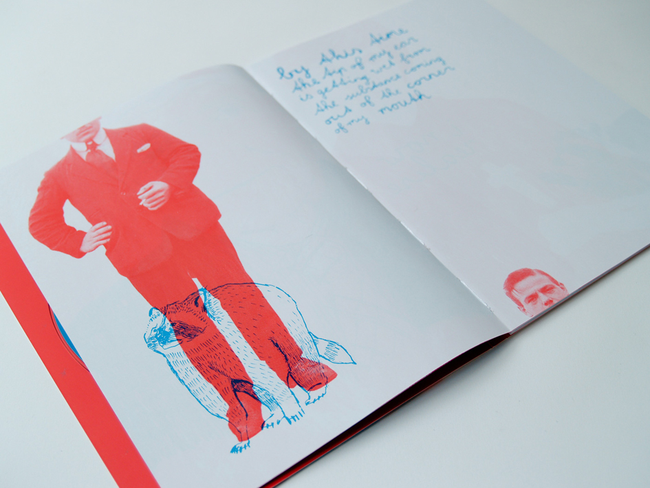
I had the chance to find out a bit more about the Artist him self. An illustrator, a designer and guitarist in the Netherlands based instrumental indie band All Shall Be Well, Bas Huissen is a very talented individual. I really like his 2 colour, linea illustration style and the way he plays with imagery. The limited edition album artwork is available to buy and is a great piece of Cd packaing design, visit allshallbewell.bandcamp to download the album for free and buy the artwork. "I wanted the artwork to play the association game, so each page in the book juxtaposes 2 visual elements which do not have a clear relationship. It's always a photograph and illustration placed together in the opposing bands colours red and blue. The aim is to create images that will conjure up stories in your head." Said Bass. Limited Edition Cd Packaging
40pp Booklet + Folder Stock Cover: Arctic, 300 gsm Content: Silk Paper, 115 gsm Colour
2 Spot
Binding Hand-sewn & Glued
You can listen to the All Shall Be Well tracks here: last.fm

.......................................................................................................................................


Friday 15 July 2011

moving brands™


One thing we love at selfmadeheroes is a strong brand identity and this is on of our all time favorites.

A robust and flexible identity for Moving Brands, an independent branding company with studios in London, Zurich, Tokyo and San Francisco.

The logo solution is a black and white geometric abstraction of the company initials, M and B. The flexible application of the marque alongside a palette of greys and an accent green provided a sophisticated visual language.

As a large organisation there is a huge amount of administration, particularly with the high turnover of moving image recording media. To solve this problem the onbody format stickers and slipcase inserts were bound into a series of 'cheque-books'. This reduced the potential for management chaos.

For the guidelines, the solution was to provide the end-user with a clear overview of the identity components. Identity manuals usually contain artwork examples at reduced size. They are often a minefield of grids, measurements and specifications. To avoid these issues we produced a 60"x40" format poster allowing us to reproduce specimens at actual size. Due to a lack of wall space (it's a precious commodity in design studios) we suspended the poster, rather than surface-mounting it. This allowed the utilization of both sides of the poster, giving maximum clarity and visual impact.

source: bibliothequedesign

Monday 4 July 2011

Bella Sky + Thomas Eriksson Architects

................................................................................................................................................................

I have worked on branding some prestigious buildings, but this is unbelievable. A great identity by the guys at Stockholm DesignLab.

Bella Sky is part of Comwell and is Scandinavia's largest hotel. It creates a distinct new profile on the Copenhagen skyline with the architecture of 3XN. The two leaning towers reach up to 76,5 meters.

SDL has created the new identity and signage system for the 814 room hotel. A unique typeface is made taking its inspiration from the architecture and is used throughout the design system; hotel rooms, amenities, menues, signage, merchandise and other supporting material.The identity for the five restaurants and Sky bar is designed to support TEA's interior of Bella Sky.

TEA, Thomas Eriksson Architects

................................................................................................................................................................