
Thursday 31 March 2011
Tuesday 22 March 2011
Dave White - #CreativeHeroes
....................................................................................................................................................
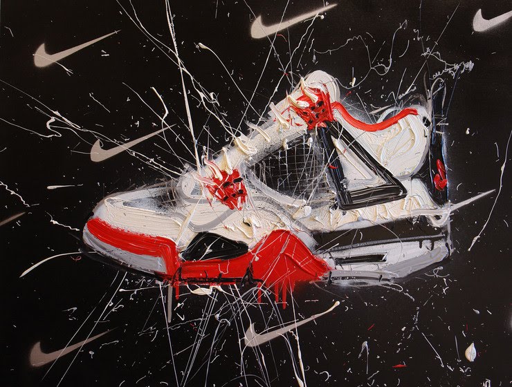
I first saw Dave Whites work whilst at university, I have always admired his style and approach to illustration. Artist Dave White was born in Liverpool, England in 1971, and has become known worldwide with his corporate collaborations. Categorised as a Pop Art for this generation,Dave White explores modern culture and objects in society.
....................................................................................................................................................


Monday 21 March 2011
Dieter Rams - #CreativeHeroes


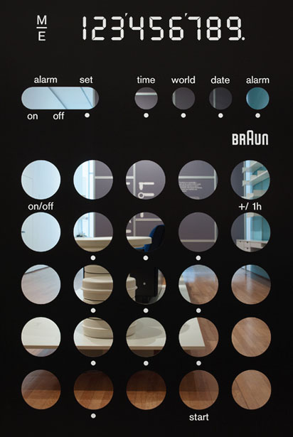

A retrospective exhibition dedicated to Dieter Rams, one of the 20th century's most influential industrial designers. As head of design at Braun, the German consumer electronics manufacturer, Rams defined an elegant and rigorous visual language for its products.
The exhibition featured 244 objects, spanning six decades of his life and work. Planned across five sections (Dieter Rams solo projects, Braun team projects under Dieter’s leadership, Vitsœ and Typology and Legacy), the design of the exhibition utilised an array of graphic expressions – each appropriate to specific areas of curatorial content. The entrance featured an internal façade with Rams' Vitsœ 606 compression system spanning the width of the upper gallery (approx 15×5m). Here the visual language from selected products set the tone.
The opening panel of each section introduced relevant product elements such as speaker grilles, calculator layouts and hi-fi interfaces. In each instance we have cut away the geometric shapes of the product interfaces – deconstructing and re-scaling them beyond the intended proportions. In the mid-section we recreated part of Ram’s house – his only built architectural project – using the same tiled grid featured in his living room. The back wall featured a seven metre-wide mural of the Audio 300 stereo with a superimposed grid demonstrating Braun's rational approach to product layout. A limited-edition screenprint was produced and sold in the Design Museum shop.
See more Less and More on this youtube film from Coolhunting.
Read the Bibliothèque Q&A for Wallpaper Magazine.
Creative Review Monograph.
Exhibition photography by Luke Hayes and Thomas Brown
Monday 14 March 2011
#AsSeenBy - the evolution of BRAUN™
“Wolfgang Schmittel joined the Braun design department as a freelancer in August of 1952. Upon his arrival, he revised the Braun logo and also gave it a reduced, constructively comprehensible form.”
— SIGHT UNSEEN
The original Braun wordmark (above) was designed by Will Münch in 1934.
This reversed option came about in 1939.
Wolfgang Schmittel’s reduced, constructively comprehensible form.
As we see it today.
Source: Logo Design Love.
Friday 11 March 2011
Wim Crouwel Limited edition Wallpaper* magazine Cover
....................................................................................................................................................
Wim Crouwel + Wallpaper* magazine = A great day in the studio
....................................................................................................................................................


Wim Crouwel + Wallpaper* magazine = A great day in the studio
....................................................................................................................................................


Thursday 10 March 2011
#InANutShell - D and AD lecture with Greg Quinton
Finish work
Arrive Late
Sit at the back....
(The talk has already started)
"Observation", look at the obvious
keep it simple
The Partners
Style or ideas?
Embrace failures as well as success
All or nothing culture
Auction off limited edition illustration (maybe do this at the end)
Envelopes with money in
Chose a winner (nice prize)
Love your good clients
Keep the good ones
Need to get in to luxury/high end fashion branding...
Lets get back to really enjoying it (creative work/being a designer)
Ideas are key/technology is secondary
small print runs, but at a very high quality & finish
weekly meeting in the local boozer.
Big thanks to Greg Quinton @the_partners for a great talk, to see more of there work visit:
the-partners.com


Wednesday 9 March 2011
#AsSeenBy - Team Impression Showcase
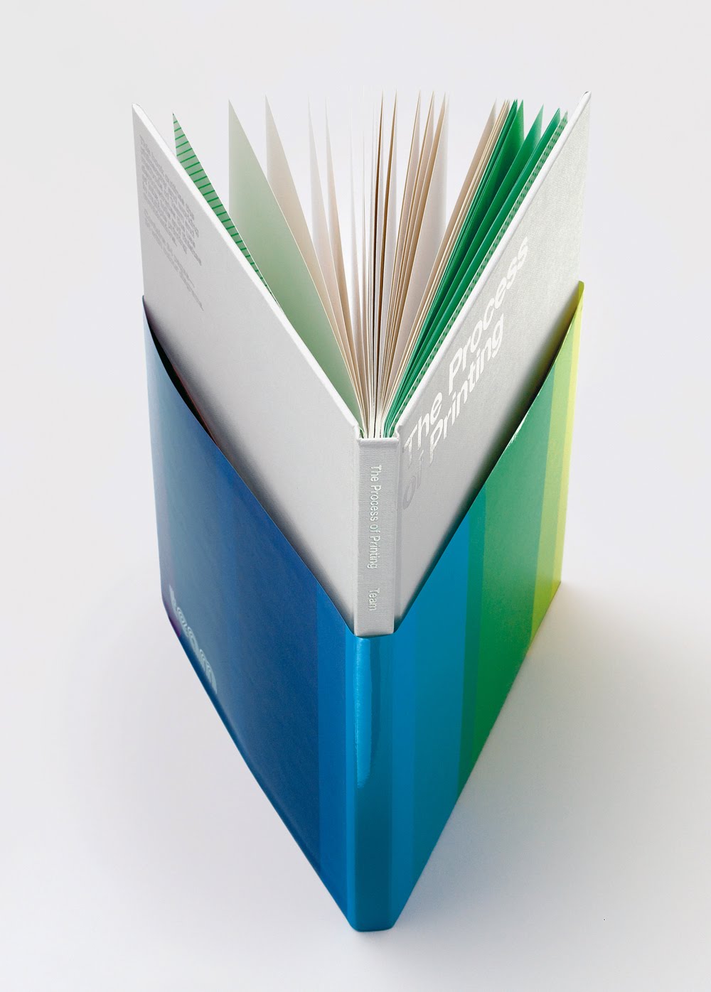
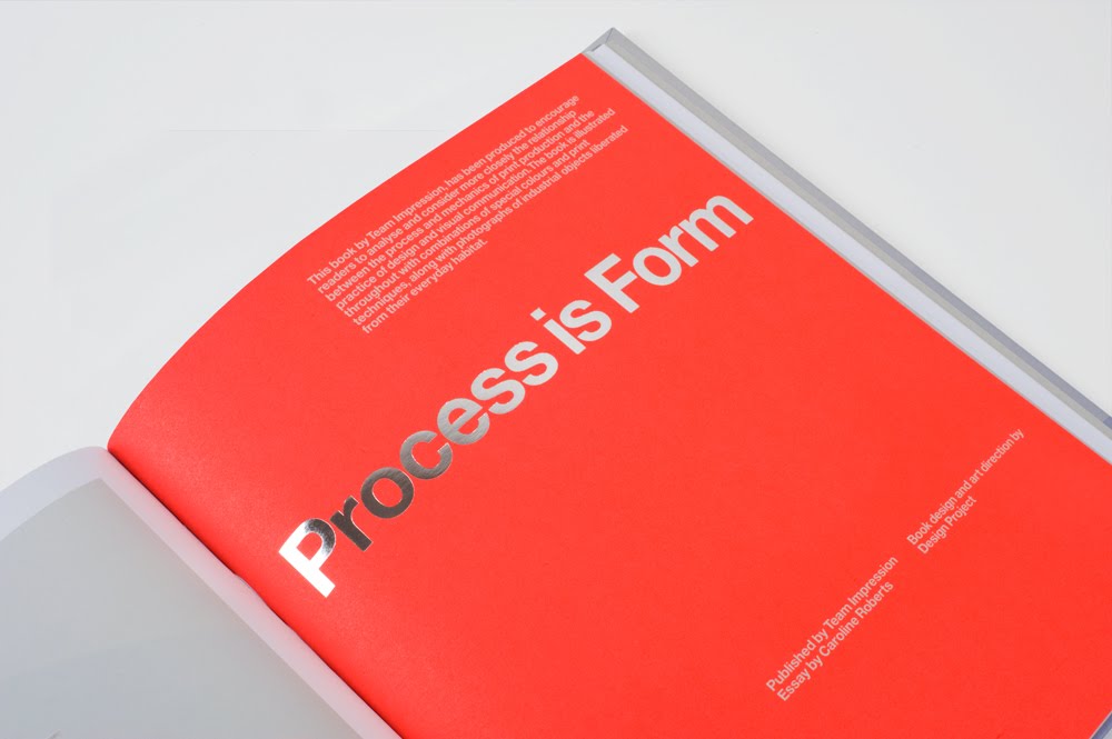
Process Is Form — Book
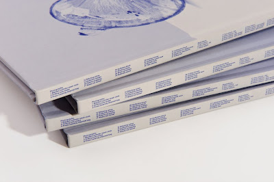
Team’s recent book – printed in 2010 and designed by Design Project – has been produced to encourage readers to analyse and consider more closely the relationship between the process and mechanics of print production and the practice of design and communication. The book is illustrated throughout with combinations of special colours and print techniques, along with photographs of industrial objects liberated from their everyday habitat.
Practical and informative, but beautifully designed and printed, the book provides an excellent platform to show off Team’s printing capabilities and also demonstrates their keenness to get ‘stuck in’ to help designers realise their printed projects, no matter how complicated they may be. The extensive use of special colours (24 colours, plus different foils and finishes throughout) really gives a taste of the comprehensive print and finishing services Team can offer.
www.designproject.co.uk
Source: septemberindustry.co.uk


Subscribe to:
Posts (Atom)