Thursday, 20 October 2011

Trust Design and Wim crouwel


............................................................................................................................................................................
Truth Design have recently worked alongside the legendary designer Wim Crouwel to create their 5th year
anniversary poster. Here at selfmadeheroes we are big fans of both Trust and Wim Crouwel so when we saw that Darren was doing a poster swap we jumped at the chance of owning one of these limited edition posters. After a couple of tweets it was sorted
and I am now the proud owner of my first piece of original Wim Crouwel design. (Had to part with an awesome Golden Limited edition poster as part of the deal tho, however it has gone to a good home. Follow @TruthDesign for your chance to get one, also check out @GLDN as they also do some great work.
............................................................................................................................................................................

Wednesday, 28 September 2011

Chadwicks and Co - Re-brand

I have recently created a brand for one of the North Wests most prestigious Birdal gown desingers. Chadwicks and Co make Bespoke English Bridal Gowns for each one of their customers. The individually hand made gowns can only be created by using the finest materials and fabrics. I wanted the brand to reflect the quality and heritage that Chadwicks and Co pride them self on.
...........................................................................................................................................................................................


Monday, 29 August 2011

Paramount Visual Identity

..........................................................................................................................................................
MindDesign created the identity for Paramount along with the signage system, some interior elements, all printed material and the website for a new members’ club at the top three floors of the of the Centre Point building.

The identity consists of a number of rising patterns made-up of shapes that relate to elements in the architecture of the building and the idea of height. In collaboration with interior designer Helene Bangsbo Andersen at Tom Dixon we designed three large rugs displayed in the foyer as well as the sliding screens in the dining area.
..........................................................................................................................................................


Monday, 22 August 2011

Uk Beer Festival - Brand Concpet

...............................................................................................................................................................
I began the Uk Beer Festival brand for a pitch whilst freelancing at CreativeLynx™ . I have developed the brand further and apply some new textures, this is a work in progress what do you think so far?
...............................................................................................................................................................


Sunday, 21 August 2011

Inspired by StudioOutput™

Here are some examples of the brilliant work from StudioOutput™. I was introduced to these guys at the last #BLAB session and just had to shout out about them. Simply awesome work with a client list to die for, my new favourite agency, (sorry Magnetic North). Check out some of their work. To see some more visit Studio-output.com

...........................................................................................................................................................
The Studio
The Studio is a digital art store we've opened in collaboration with Sony Computer Entertainment Europe (SCEE) – who you'll probably know better as Sony PlayStation.

It brings the work of some of the most coveted names in graphic and digital design to the PlayStationStore, with original artwork fully digitised to create a range of downloadable static and dynamic themes for PS3 and PSP. Themes are curated, managed and developed by Studio Output, offering a new platform for artists to showcase their work to the world – and an ever-changing array of fantastic artwork for the ever-growing PlayStation audience.
.............................................................................................................................................................................


...........................................................................................................................................................
BBC 1Xtra Djs and Show Branding
As part of our ongoing relationship with BBC 1Xtra we've recently revised the whole look and feel for the station. Aiming to create something more confident, slick and simple, we've produced a stripped-back scheme which focuses on big, bold type and loud colours.
...........................................................................................................................................................


...........................................................................................................................................................
Granimator™ vs Battle pack
Granimator™ is an intensely visual wallpaper app for the iPad, created by London-based studio ustwo™. Starting with custom graphic packs, users can drag, pinch, push and rearrange their compositions to create personalised wallpapers that can be shared online at granimator.com.
..........................................................................................................................................................................


...........................................................................................................................................................
Granimator™ Minisrty of Sound
'MoS Remix' is a Granimator™ pack we produced to accompany our November and December 2010 Saturday Sessions artwork for Ministry of Sound. Created for a series of print flyers and press ads, the artwork can also be remixed using Granimator™
As part of our ongoing relationship with BBC 1Xtra we've recently revised the whole look and feel for the station. Aiming to create something more confident, slick and simple, we've produced a stripped-back scheme which focuses on big, bold type and loud colours
When the lovely people at Wax Jambu asked us to design a brand identity for their new bar, they knew the people of Islington were ready for a boutique venue with a difference.
..........................................................................................................................................................................


Source: All images and descriptions have been taken from the studioOutput website.


Saturday, 20 August 2011

Molton Brown Identity + Mark

............................................................................................................................................................................................
Here at selfmadeheroes we love a brand re-fresh & the new Molton Brown identity and mark by the guys at Farrow
is an excellent example.
............................................................................................................................................................................................


Wednesday, 27 July 2011

#AsSeenBy: All Shall Be Well & Bas Huissen

.......................................................................................................................................
Here at selfmadeheroes we love to share the creative things we find. After spotting some great illustration work on Designinspiration.net,
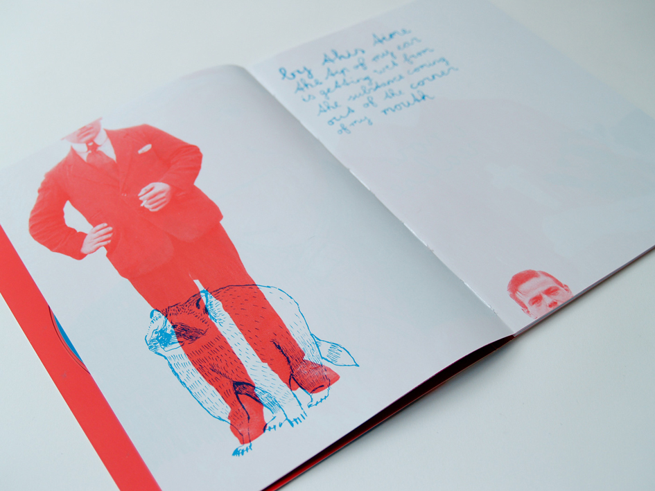
I had the chance to find out a bit more about the Artist him self. An illustrator, a designer and guitarist in the Netherlands based instrumental indie band All Shall Be Well, Bas Huissen is a very talented individual. I really like his 2 colour, linea illustration style and the way he plays with imagery. The limited edition album artwork is available to buy and is a great piece of Cd packaing design, visit allshallbewell.bandcamp to download the album for free and buy the artwork. "I wanted the artwork to play the association game, so each page in the book juxtaposes 2 visual elements which do not have a clear relationship. It's always a photograph and illustration placed together in the opposing bands colours red and blue. The aim is to create images that will conjure up stories in your head." Said Bass. Limited Edition Cd Packaging
40pp Booklet + Folder Stock Cover: Arctic, 300 gsm Content: Silk Paper, 115 gsm Colour
2 Spot
Binding Hand-sewn & Glued
You can listen to the All Shall Be Well tracks here: last.fm

.......................................................................................................................................