Wednesday, 27 July 2011

#AsSeenBy: All Shall Be Well & Bas Huissen

.......................................................................................................................................
Here at selfmadeheroes we love to share the creative things we find. After spotting some great illustration work on Designinspiration.net,
I had the chance to find out a bit more about the Artist him self. An illustrator, a designer and guitarist in the Netherlands based instrumental indie band All Shall Be Well, Bas Huissen is a very talented individual. I really like his 2 colour, linea illustration style and the way he plays with imagery. The limited edition album artwork is available to buy and is a great piece of Cd packaing design, visit allshallbewell.bandcamp to download the album for free and buy the artwork. "I wanted the artwork to play the association game, so each page in the book juxtaposes 2 visual elements which do not have a clear relationship. It's always a photograph and illustration placed together in the opposing bands colours red and blue. The aim is to create images that will conjure up stories in your head." Said Bass. Limited Edition Cd Packaging
40pp Booklet + Folder Stock Cover: Arctic, 300 gsm Content: Silk Paper, 115 gsm Colour
2 Spot
Binding Hand-sewn & Glued
You can listen to the All Shall Be Well tracks here: last.fm

.......................................................................................................................................


Friday, 15 July 2011

moving brands™


One thing we love at selfmadeheroes is a strong brand identity and this is on of our all time favorites.

A robust and flexible identity for Moving Brands, an independent branding company with studios in London, Zurich, Tokyo and San Francisco.

The logo solution is a black and white geometric abstraction of the company initials, M and B. The flexible application of the marque alongside a palette of greys and an accent green provided a sophisticated visual language.

As a large organisation there is a huge amount of administration, particularly with the high turnover of moving image recording media. To solve this problem the onbody format stickers and slipcase inserts were bound into a series of 'cheque-books'. This reduced the potential for management chaos.

For the guidelines, the solution was to provide the end-user with a clear overview of the identity components. Identity manuals usually contain artwork examples at reduced size. They are often a minefield of grids, measurements and specifications. To avoid these issues we produced a 60"x40" format poster allowing us to reproduce specimens at actual size. Due to a lack of wall space (it's a precious commodity in design studios) we suspended the poster, rather than surface-mounting it. This allowed the utilization of both sides of the poster, giving maximum clarity and visual impact.

source: bibliothequedesign

Monday, 4 July 2011

Bella Sky + Thomas Eriksson Architects

................................................................................................................................................................

I have worked on branding some prestigious buildings, but this is unbelievable. A great identity by the guys at Stockholm DesignLab.

Bella Sky is part of Comwell and is Scandinavia's largest hotel. It creates a distinct new profile on the Copenhagen skyline with the architecture of 3XN. The two leaning towers reach up to 76,5 meters.

SDL has created the new identity and signage system for the 814 room hotel. A unique typeface is made taking its inspiration from the architecture and is used throughout the design system; hotel rooms, amenities, menues, signage, merchandise and other supporting material.The identity for the five restaurants and Sky bar is designed to support TEA's interior of Bella Sky.

TEA, Thomas Eriksson Architects

................................................................................................................................................................


Saturday, 25 June 2011

Booki.sh by Friends of mine

This is such a great identity and here at selfmadeheroes we just love it! With its visual cliche of using the spectaculars as the cap 'B' and a simple colour palette this brand goes in the inspiration folder. Take a look for yourself and let us know what you think....


Monday, 6 June 2011

GF Smith V SEA Design = Simply Beautiful


Master Specifier 2011

Select Colour
The entire collection of colour stocks shown as chips by colour and shade, with accompanying stock charts broken up by pages of photography.

Select Black+White
All black, white and every monochrome shade in-between shown as chips, with accompanying stock charts.

1 Colorplan/2 Smooths/3 Textures/4 Specials
Individual books showing every colour and weight as a large swatch, grouped by paper/brand type and interleaved with Factory Yellow spec pages that double as section dividers.


Sunday, 22 May 2011

A night of Inspiration - #NoteToSelf Creative Consortium

.............................................................................................................................................


After being inspired by recent creative events in Manchester it got me thinking 'why was there nothing like this when I was a student?' so after a night at Northern Digital I sent James Sommerville of ATTIk a drunken tweet asking him to do a design talk for free in Huddersfield, the last thing I expected was a reply saying "yes, when and where". So with the group creative director of one of the worlds most respected agencies on board I first started to panic and then began calling around and pulling in some favours to make it a great night.

We quickly got more speakers interested in getting involved namely Ben Holden from Cahoona, Richard Sharp from The Sharp Agency and Jeffrey Bowman an Ex-Huddersfield student turned lecturer. So we had our speakers all we needed now was the venue, this came courtesy of The Media Centre in Huddersfield - we could not have asked for a better venue, its was perfect for an open forum style evening


With the poster printed (big thanks one69a) and the date set the night was fast approaching and it looked like everything was in place. The event started with a quick introduction by myself and then Mr Ben Holden kicked off the night with a talk about driving on through the “idea plateau”. I first saw Ben Holden at a Northern Digital night and I knew he would be great for the NoteToSelf event and he did not disappoint.

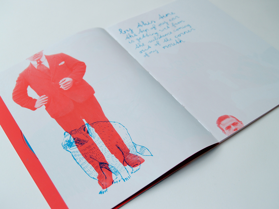
Following Ben was Jeffrey Bowman, (AKA Mr Bowlegs) - He is also an ex-student of Huddersfield University. He began by talking about stepping back from what he is most widely recognised for which is his character based illustration. He informed us about a recently discovered love of walking outdoors, to take a chance to be inspired by the world around him and to strip back his work to a simpler less “Mr Bowlegs style”.

His decision to step back from his “typical” style and experiment again rather than do piece after piece in his own style was a great reminder to all that it’s good to step back and look at your work from time to time.

With two excellent speakers already ticked off, Richard Sharp had some hard acts to follow but with his heart felt and funny approach to inspiration we had nothing to fear.

He’s inspired by people and their stories and backgrounds, after finding early in his career that chasing the big job title and being published in the D&AD annual wasn’t everything he now spends time looking at what people in all walks of life and death and fiction do – Ben Franklin and Homer Simpson. Richard has a clear passion for creativity and if he finds someone that inspires him he will take it upon himself to learn as much as possible about them, some might say stalking, however I found this approach very interesting. Richard finished his talk by asking everyone to look around you, and he simply said "Take a second to look around you – the person next to you could have the most inspiring story you’ve ever heard, that the person sat next you could be your inspiration."

With James Sommerville running late I was nervous about meeting him as he was one of my creative heroes whilst studying at University and beyond. With minutes to spare James arrived, we had a quick chat and my nerves where put at ease as James was down to earth and a top man.

James began his talk by saying inspiration started with "ME", this initially took me aback until he explained the rational behind his thinking… James went on to give us some background on how ATTIK started and some of their incredible global branding efforts for Coke™ & Scio™ over the last few years. James and the ATTIK team take a lot of time and put in a lot of effort getting to know the people who will buy the product they brand and advertise, James also believes that people are where inspiration starts. When James began the World Cup branding for Coke™ they demanded that they had to go and meet the people of South Africa, he feels working remotely on such a global brand would not have got the right tone or have a personal touch. Some of the points James put across echoed the other speakers but coming from someone who’s run one of the worlds most respected agencies for 25 years it’s nice to see that the passion for the little details is as strong as ever.

#NoteToSelf - Creative Consortium started with a simple tweet and finished with the attendees asking when the next event will be, this event could not have happened without the support of the following: The Drum, One69a Screen Printing, Awesome4some, The Media Centre, Hudd Digital and Fudge Technical. I would like to personally thank all the speakers for taking the time to get involved in this event & a special mention to Dalton Maag for sending us some fantastic Font Specimen Sheets and books for the Creative Goodie Bags. Watch this space for the next #NTS event.


Useful links:

NoteToself - Creative Consortium